Bee Jay’s.
A humble Gas and Electrical company turned corporate — the brief to turn this tradie into a CEO. I was given the task to use a real company, and inflate it’s persona to reflect that of a corporation, and provide an annual report to it’s customers.
Leading by example.
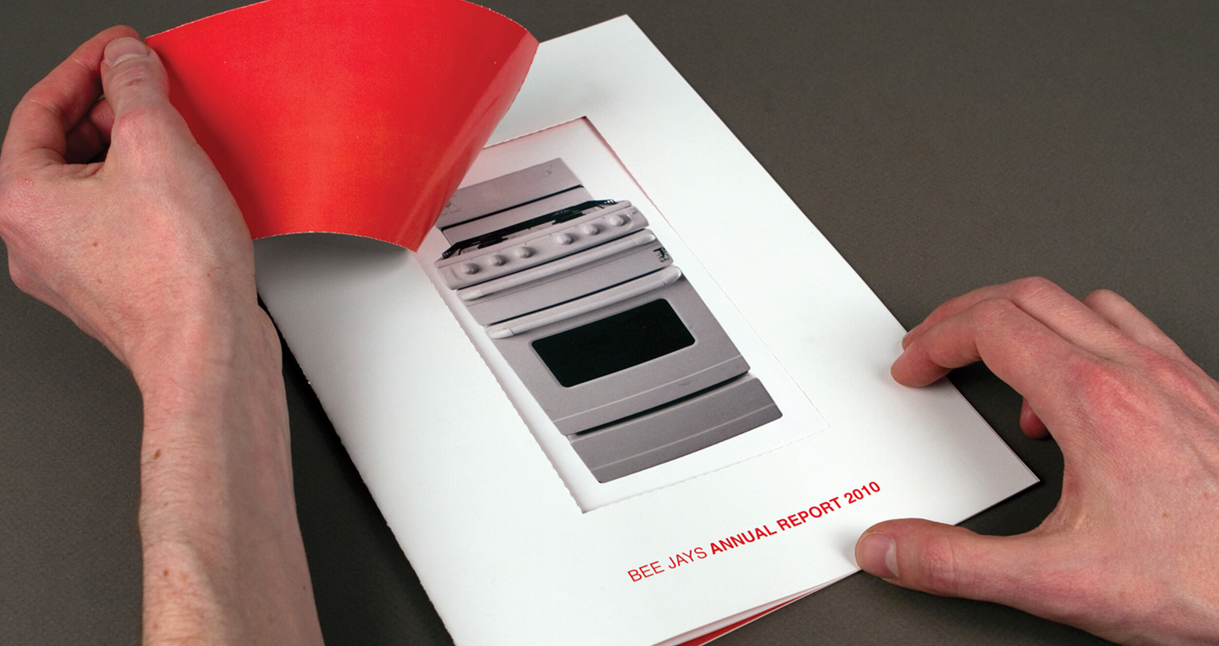
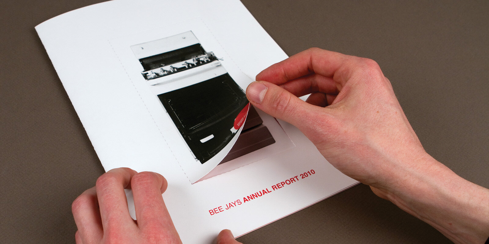
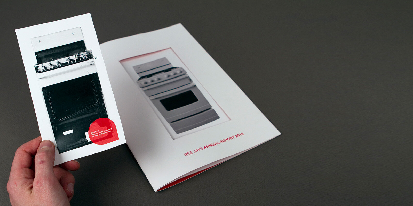
My first impression on this brief was that being a corporate job it could be a boring job, so I aimed to make the project anything but. The brand already had a strong colour pallet of red and white, so I stuck with that throughout, but tried to execute it in a way that was visually striking, and physically interesting to hold in your hands, by going a little but further with the stock used, and printing techniques.
Client.
Bee Jay’s Gas & Electric
Project.
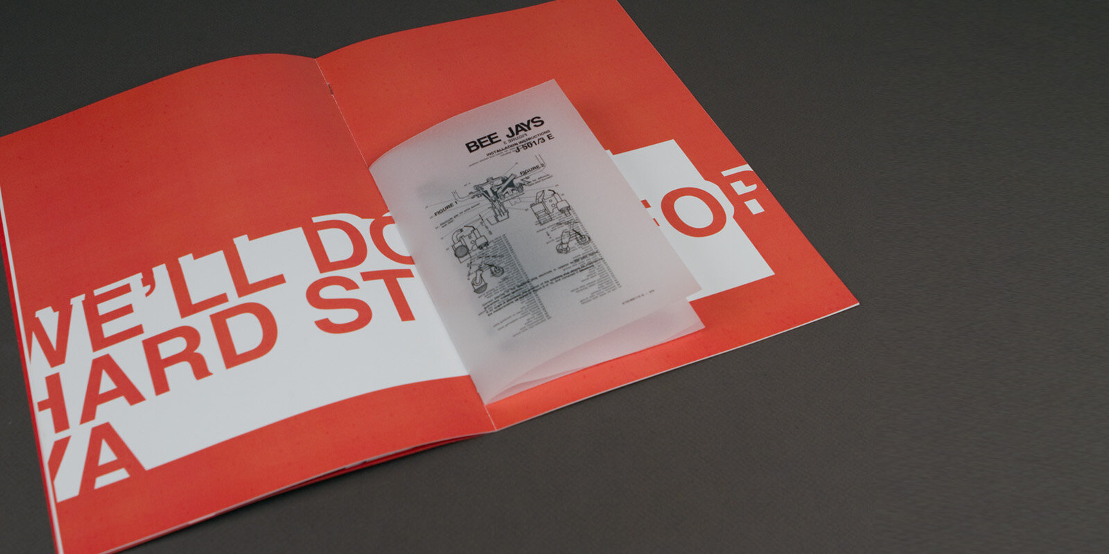
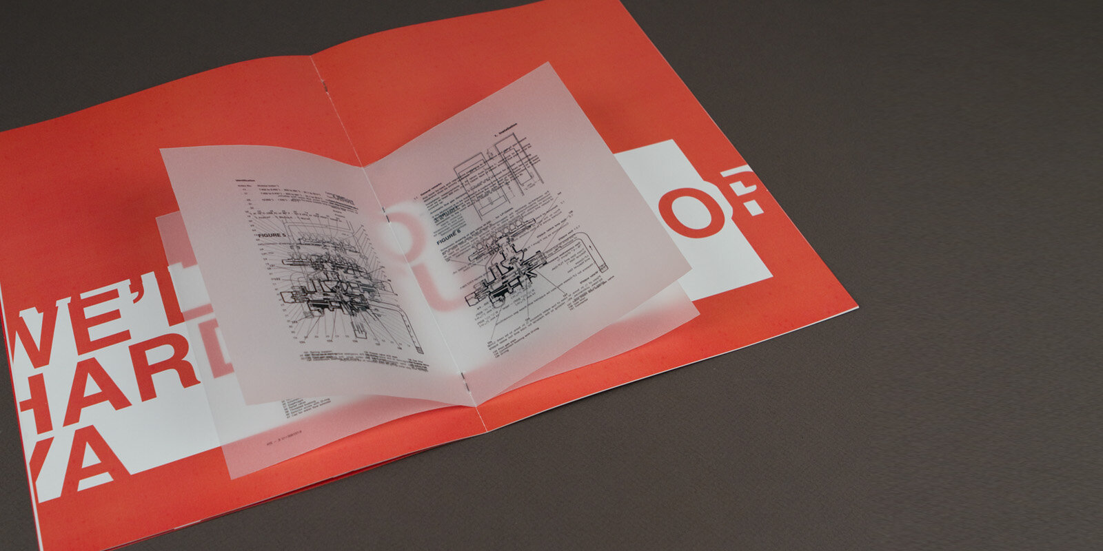
Colour Booklet with perforated pop out cover & transparent inlay booklet
Identity
Illustration
Photogrpahy
Layout Design
Brand Direction
Printing Direction